About this project
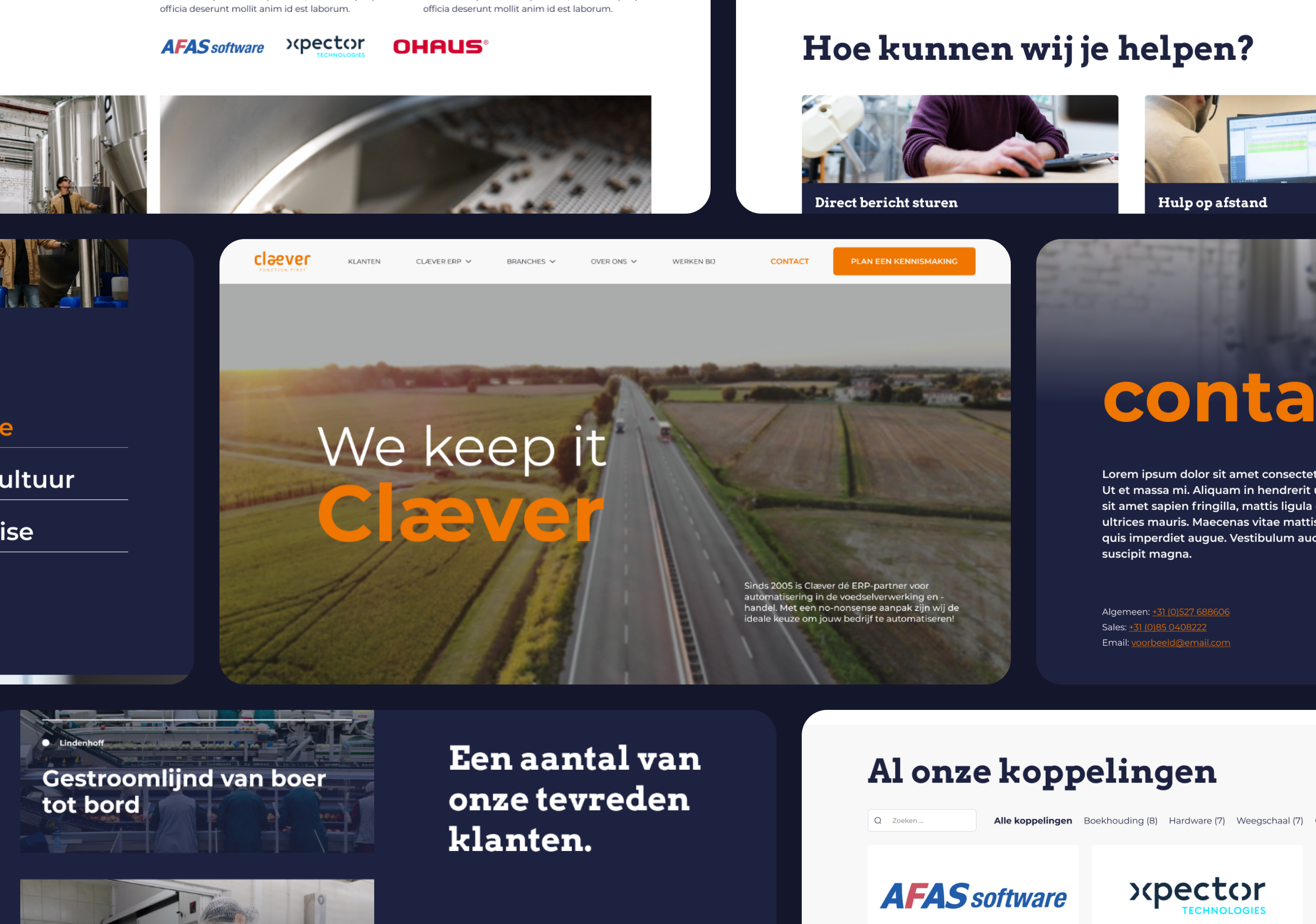
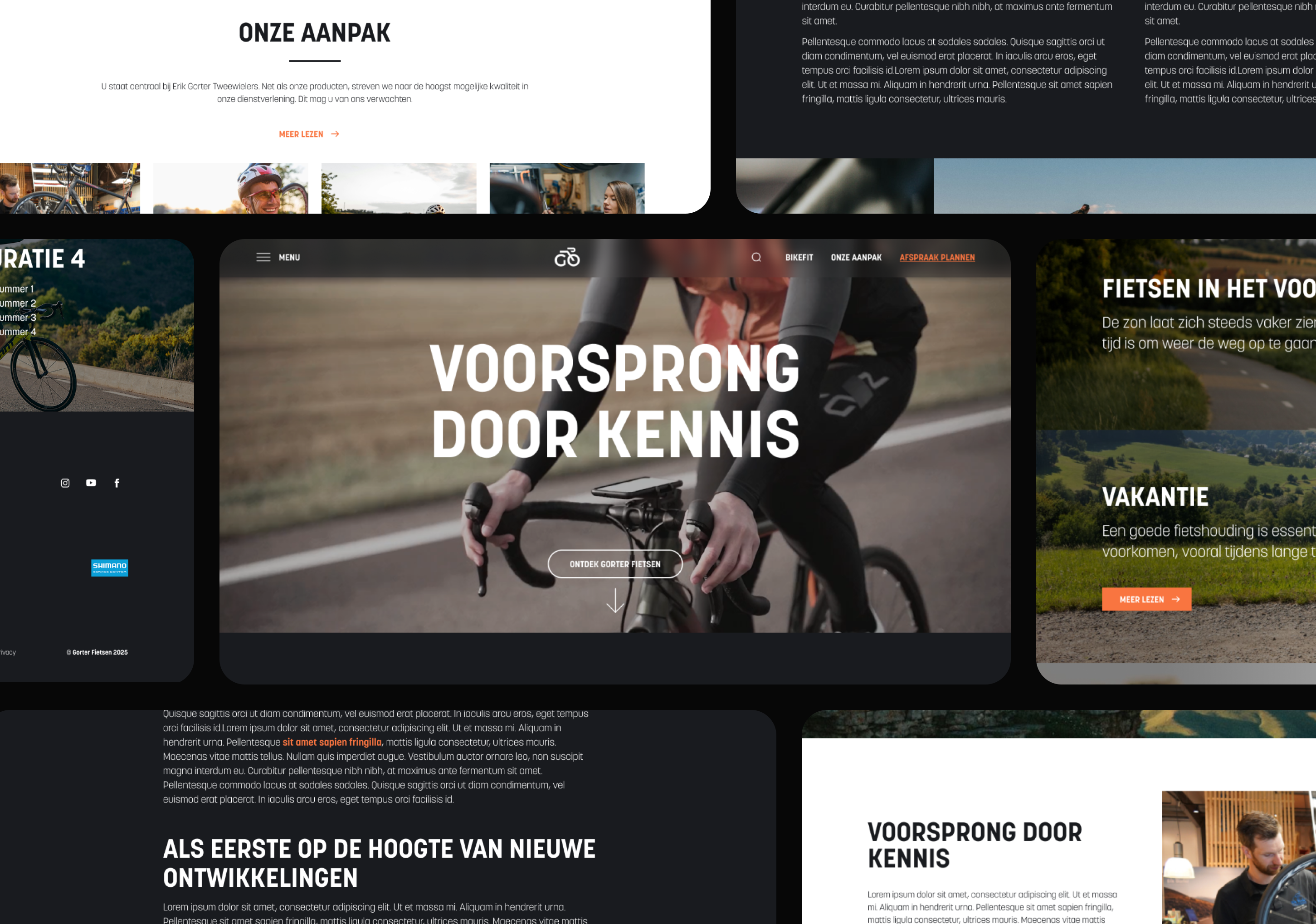
Gorter Tweewielers
A premium website for Gorter Tweewielers, blending high-end branding with community-driven storytelling to reflect their deep cycling expertise.
Year
2025
Type
Webdesign
Agency
HQ Online
Goal
Premiumization
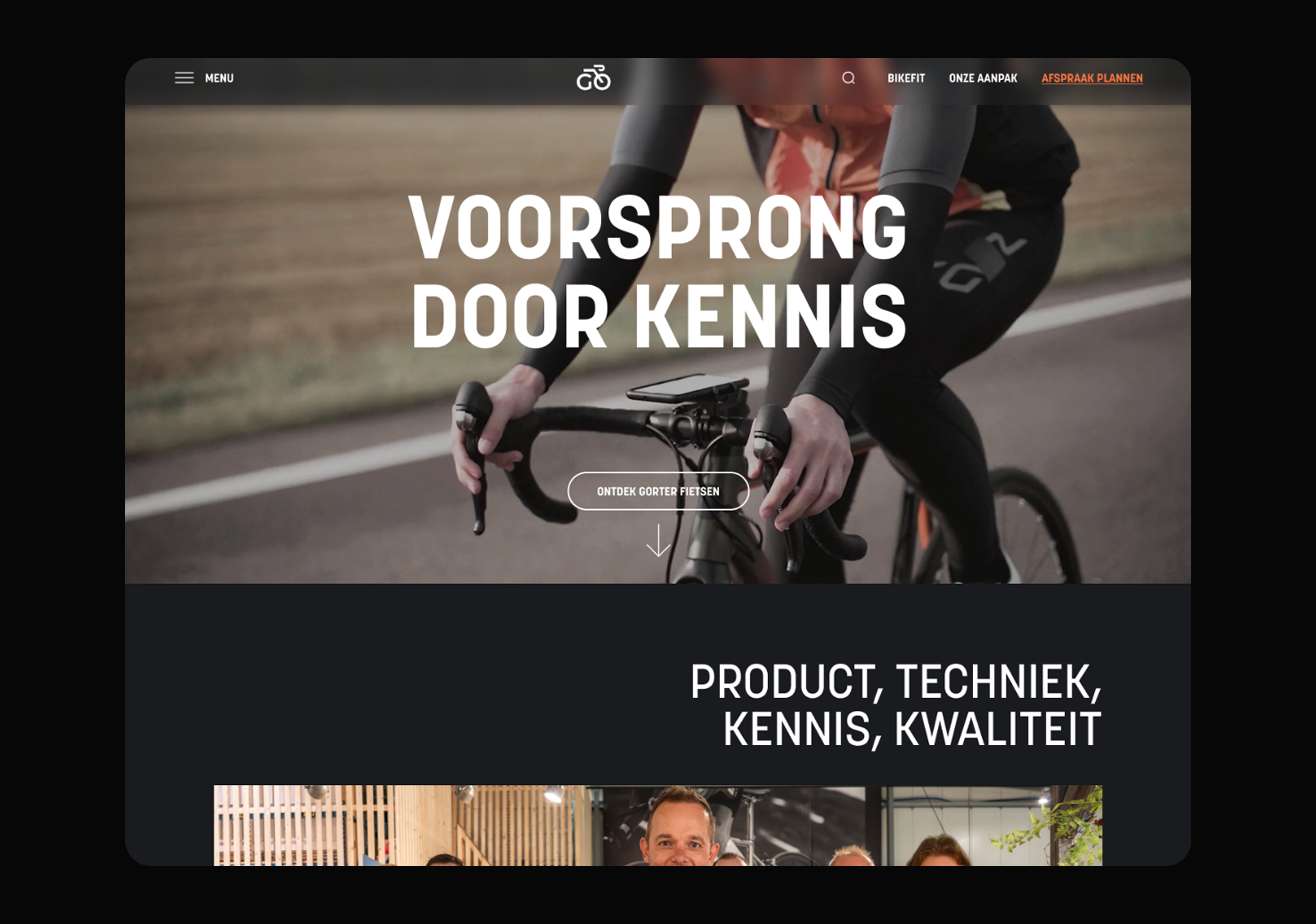
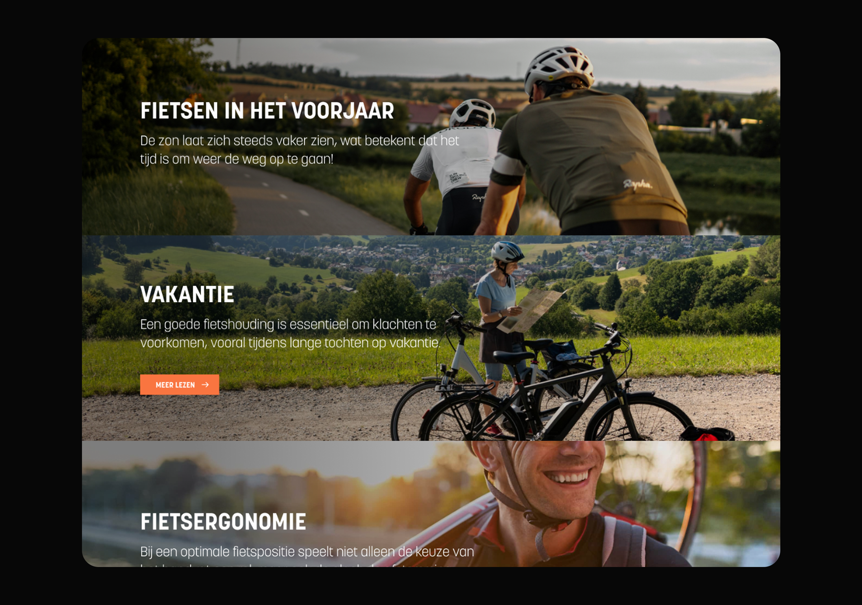
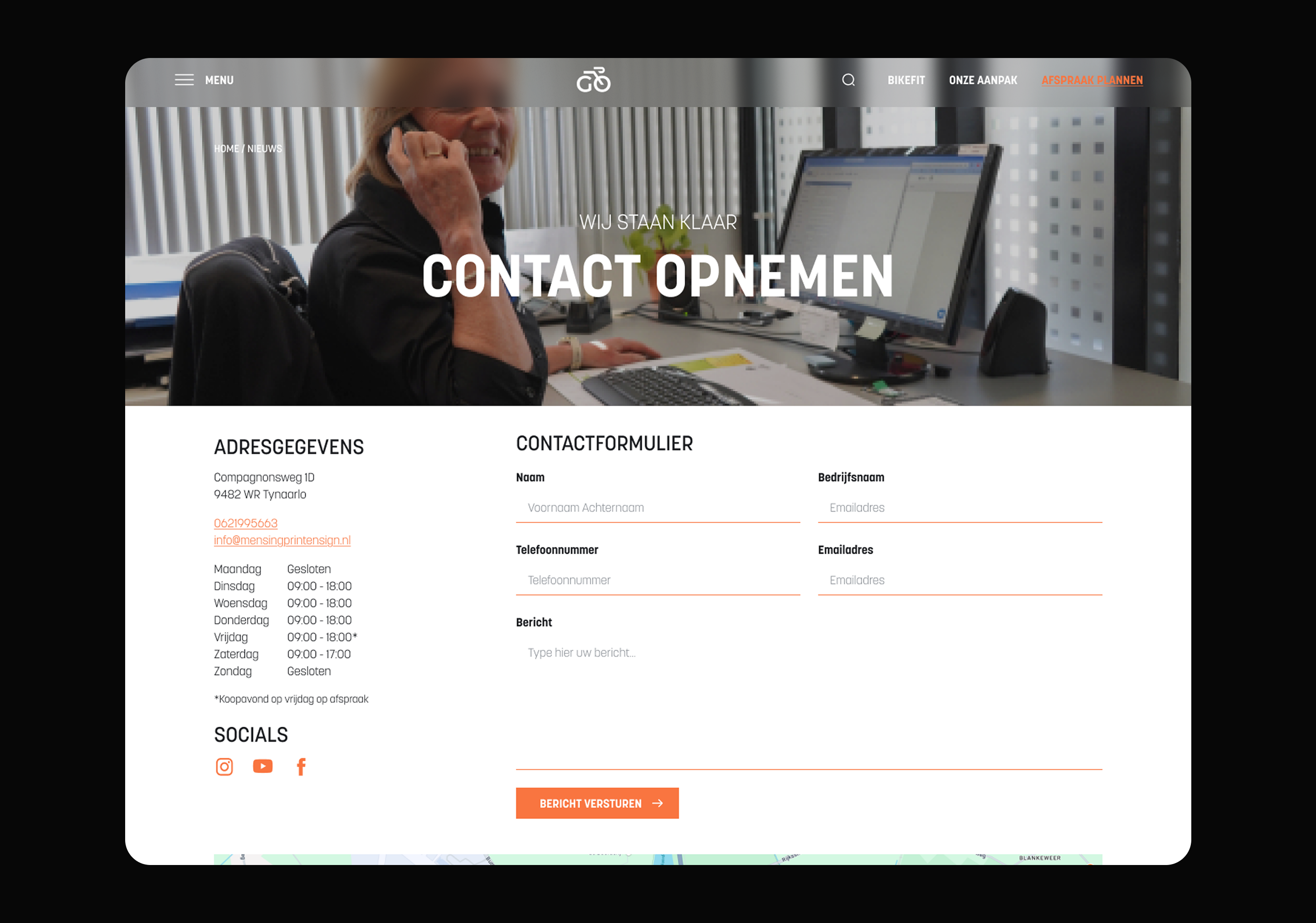
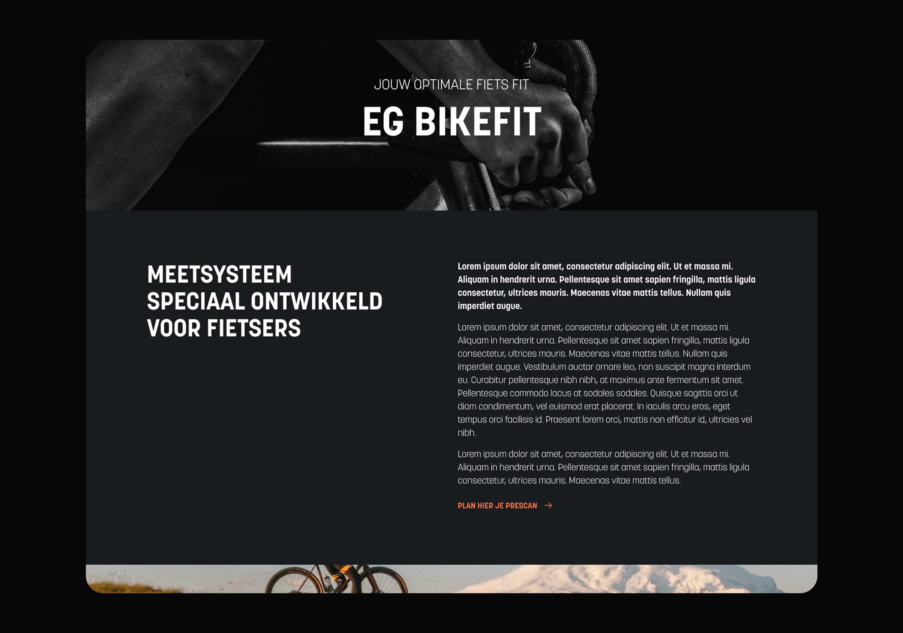
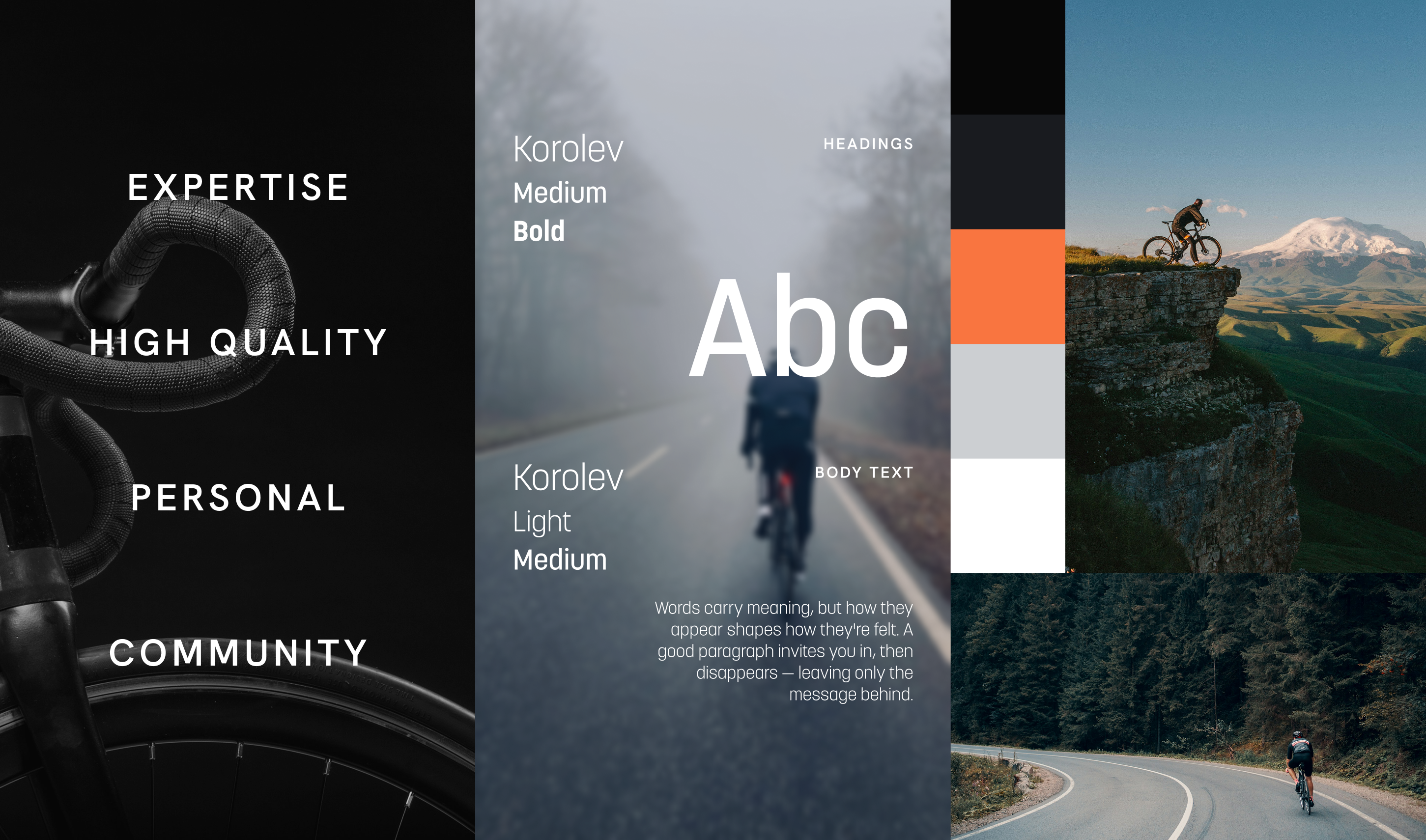
Gorter Tweewielers wanted a site that matched the caliber of their service; top-tier, certified, and personal. As a Shimano Service Center offering precision bike fitting and premium brands, the website needed to reflect both their technical expertise and their tight-knit biking community. Visually, the reference point was luxury: think Bentley or Ferrari, but with handlebars. To hit that mark, I developed a dark-themed design system that let bold visuals breathe, supported by a strong typographic foundation and minimal color usage for impact. The homepage leads with a custom video hero to instantly communicate craftsmanship and movement. Throughout the site, photography plays a central role in building authenticity and showcasing the lifestyle around the products, while carefully adapted layouts echo the polish of premium brands without losing the accessibility needed to invite people into their world.
Impressions
Process
The project began with in-depth conversations to uncover the balance between high-end aesthetics and approachability. I started by studying how luxury automotive and fashion brands handle layout and rhythm, and then explored how that could be adapted to a bike shop without feeling out of place. Early concept moodboards focused on tone and visual language; clean, confident, personal. From there, I moved into sketches and low-fidelity layout explorations, refining as feedback came in. The hero video concept emerged mid-way through and became a defining piece of the homepage. Typography was fine-tuned to feel modern yet timeless, and attention was given to how product pages and service info conveyed trust and care. Each round of feedback helped lock in the balance between elite branding and local community warmth.
The project began with in-depth conversations to uncover the balance between high-end aesthetics and approachability. I started by studying how luxury automotive and fashion brands handle layout and rhythm, and then explored how that could be adapted to a bike shop without feeling out of place. Early concept moodboards focused on tone and visual language; clean, confident, personal. From there, I moved into sketches and low-fidelity layout explorations, refining as feedback came in. The hero video concept emerged mid-way through and became a defining piece of the homepage. Typography was fine-tuned to feel modern yet timeless, and attention was given to how product pages and service info conveyed trust and care. Each round of feedback helped lock in the balance between elite branding and local community warmth.
Other projects
This project shows how thoughtful design can elevate a brand without losing its personal core. If you're interested in how premium aesthetics meet usability, check out a few more related projects below.